From a gif to concert visuals
The backstory
I played in Scapa Flow, a synth band, now Calle, one of the other members has started his own project «Hoy». A year ago he asked me for a logo that I drew and animated.

The base logo is five rectangular shapes that spell «hoy» and is made in three variants: stacked, diagonal, and horizontal.
A couple of weeks ago I get a mess:
«Got a gig confirmed in Gävle today. February
A dream come true
Bloody hell, doing stage visuals has been a dream of mine, but what the hell do I do when I only have a shitty gif-animation and my After Effects skills are almost zero.
Well, I build an app for it of course.
![]()
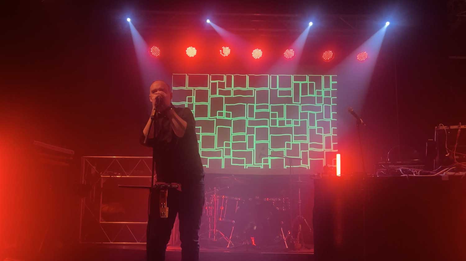
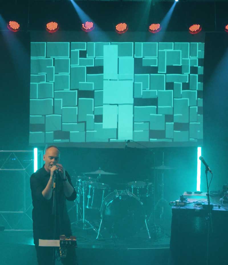
The base animation is the shapes draw themselves in with an outline effect and flicker with a stroboscopic fill. It’s hypnotic, and it would work brilliantly on stage.
The original animation was built in After Effects, a looping
But when I got Calles setlist I realised I needed a ton more variations to match the songs:
- Different colour schemes.
- Faster strobes.
- Outlines only.
- Neon green on black.
- A slow, moody version.
Each variation meant diving back into the css, changing values by hand, testing, exporting … over and over. Clearly it would turn out to be a pain in the ass.
So based on the other apps I’ve built I decided to build an svg animation app for this.
The Upstager app
Upstager is a browser-based control panel that sits alongside my animation. It has three columns:
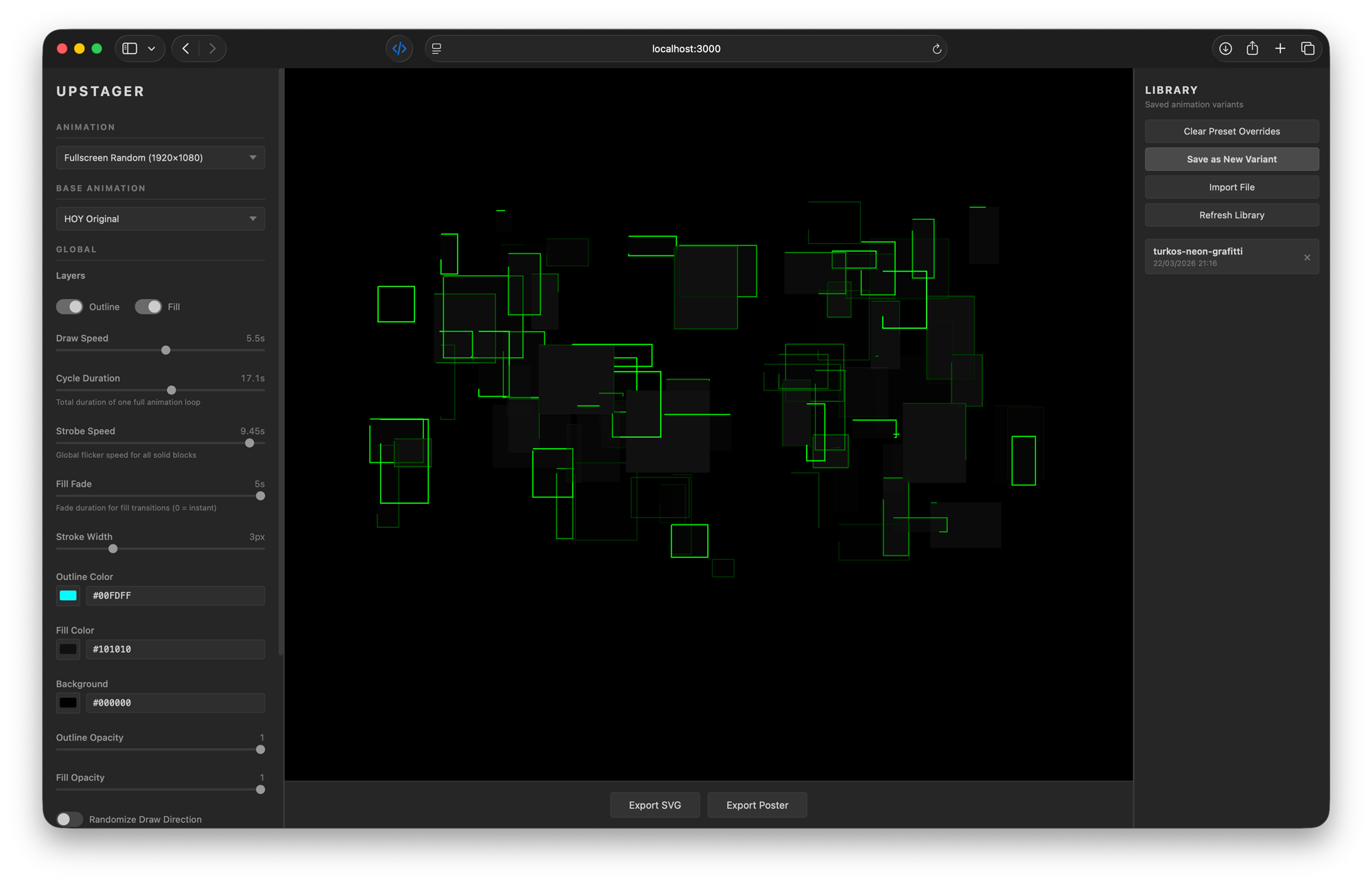
- Left sidebar – all the controls: sliders, colour pickers, and toggles
- Centre – a live preview of the animation that updates instantly as I adjust things
- Right panel – a library of saved variants I can recall anytime
No installation. No complex setup scripts. I just open a browser tab and start designing.
What Upstager can do


The variant library
Every combination I like, I save as a variant with a descriptive name: «strobe-outlines», «neon-green», «slow-moody», «cammo-fade-in-slow». These are stored as small json files (simple text data) that I can reload anytime, share with collaborators, or version-control alongside the project.
Export options
When a variant looks right, I can export it in three formats:
svg – a standalone animated file that plays in any browser (those are the ones you see in theis article), scales to any size, and weighs just a few kilobytes. Perfect for web use or embedding in presentations.
mp
4 (1920x1080, H.264 ) – a proper video file I can drop straight into Premiere Pro and combine with film clips. The app renders it frame-by-frame at30 fps.
Multiple animation layouts
Beyond the original compact logo, I prepared
- Original (
500x500 ) – the classic hoy animation - Fullscreen tiled (
1920x1080 ) – logo repeated across the canvas - Fullscreen random (
1920x1080 ) – shapes scattered randomly


Each layout uses the same control system, so all the colour, speed, and visibility tweaks work regardless of which base I start with.
How it was built
The key was knowing what I wanted. Having a fairly clear idea about how it should work: what controls it should have, how the animation engine shoud work, how saving and export should work.
Running Claude in Plan mode me and Claude created a prd (Product Requirements Document): a document outlining the purpose, features, functionality, and behavior of a new product or feature.
It’s vanilla html, css, and JavaScript. The simplest possible web technology stack.
The architecture became super simple:
- Seven JavaScript files, each with a clear job (state management, rendering, controls, library, two exporters, and a main entry point)
- Two css files for layout and control styling
- One html page that ties it all together
- One data file per base animation, describing the choreography of the base pattern that shall be animated.
No TypeScript. No React. No webpack. No bloated frameworks. You start a simple local server, open the page, and it works.
The result
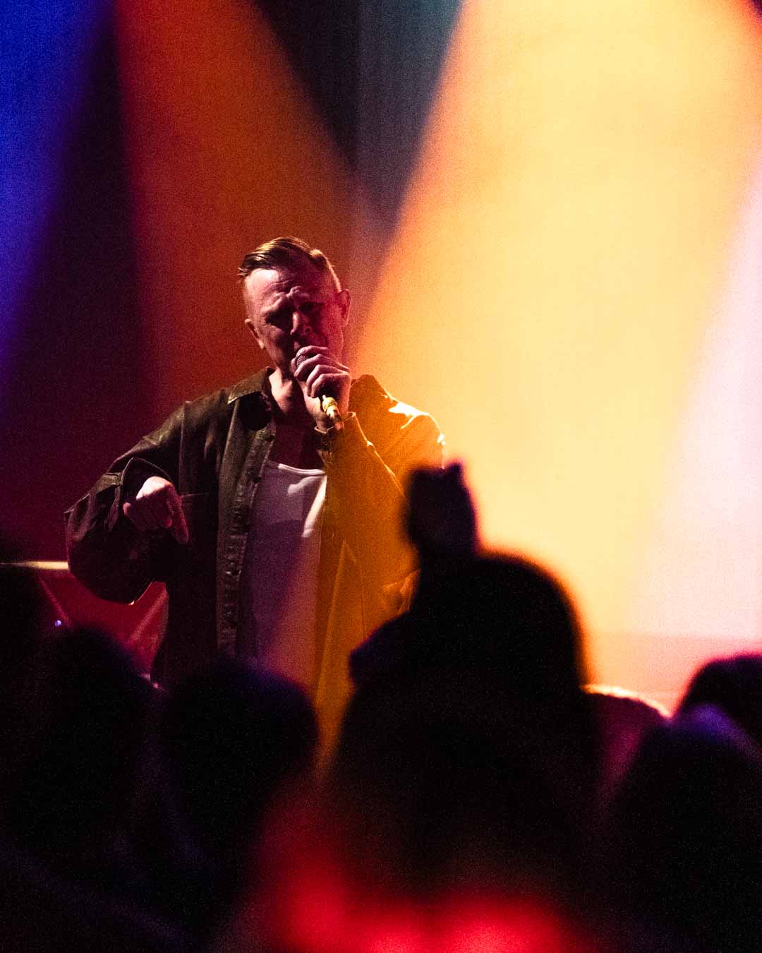
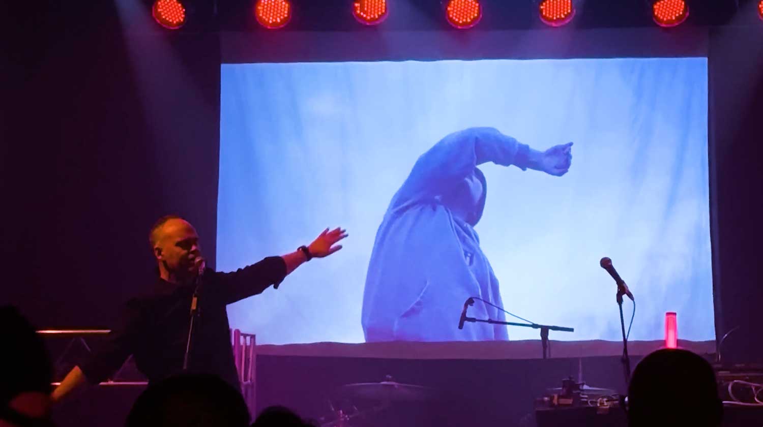
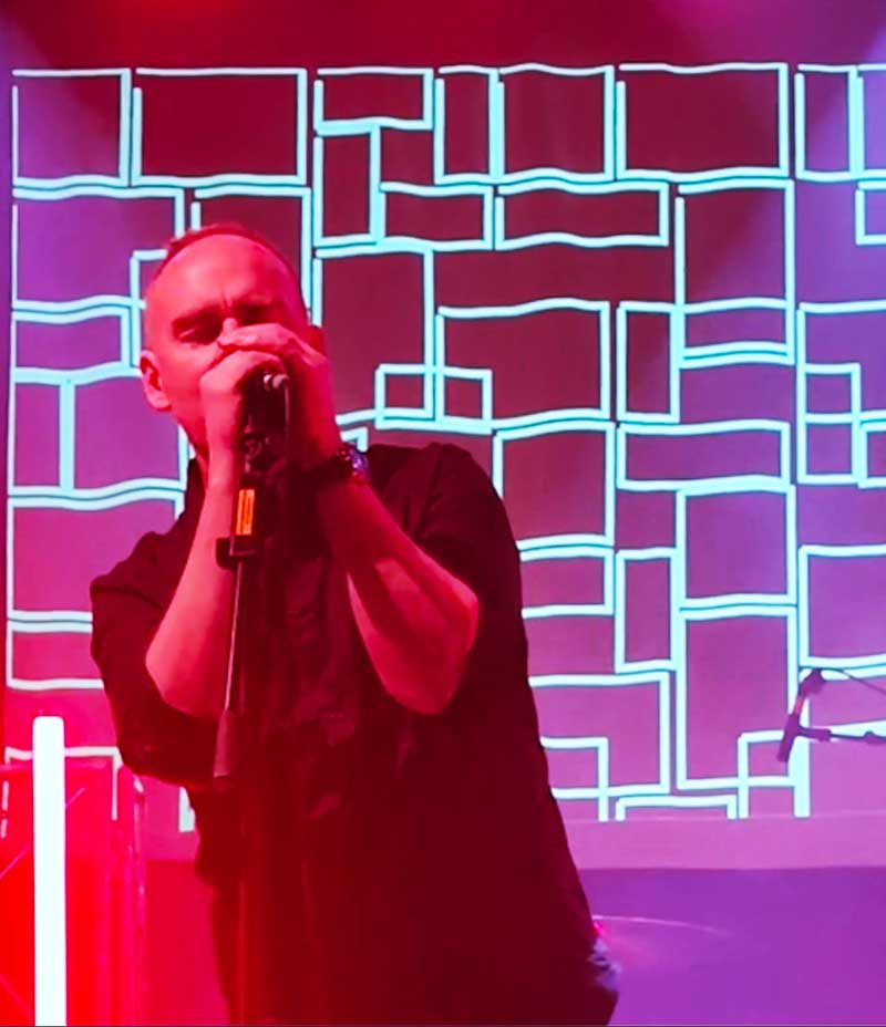
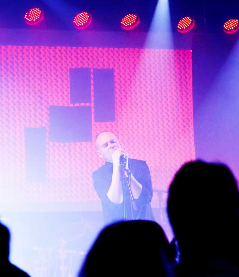
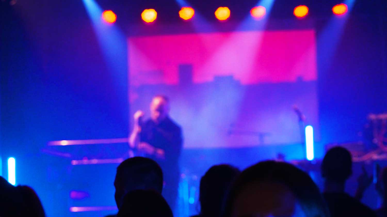
What started as one small logo was now a blown up stage show. I bloody love the life as a designer.
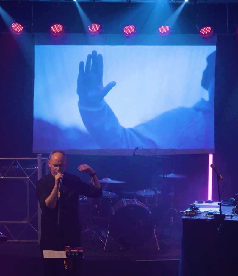
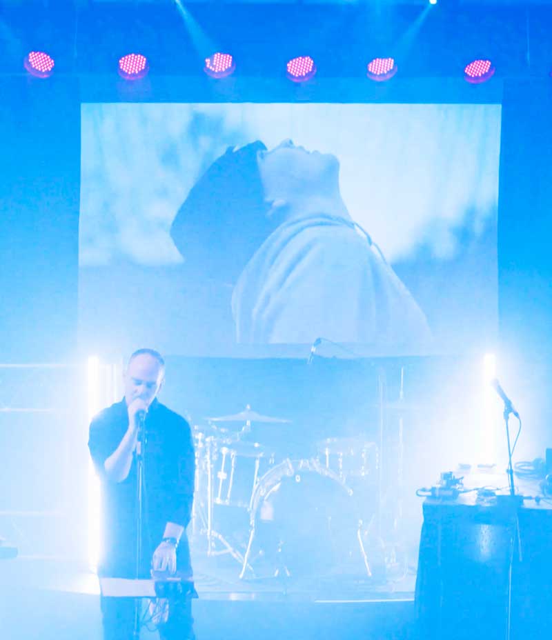
For the final visuals I pulled all the animations into Premiere and combined them with footage of mine from other side project. That way the visuals could match the songs of Hoy in the best possible way.
Here is a short reel from the show and the visuals.
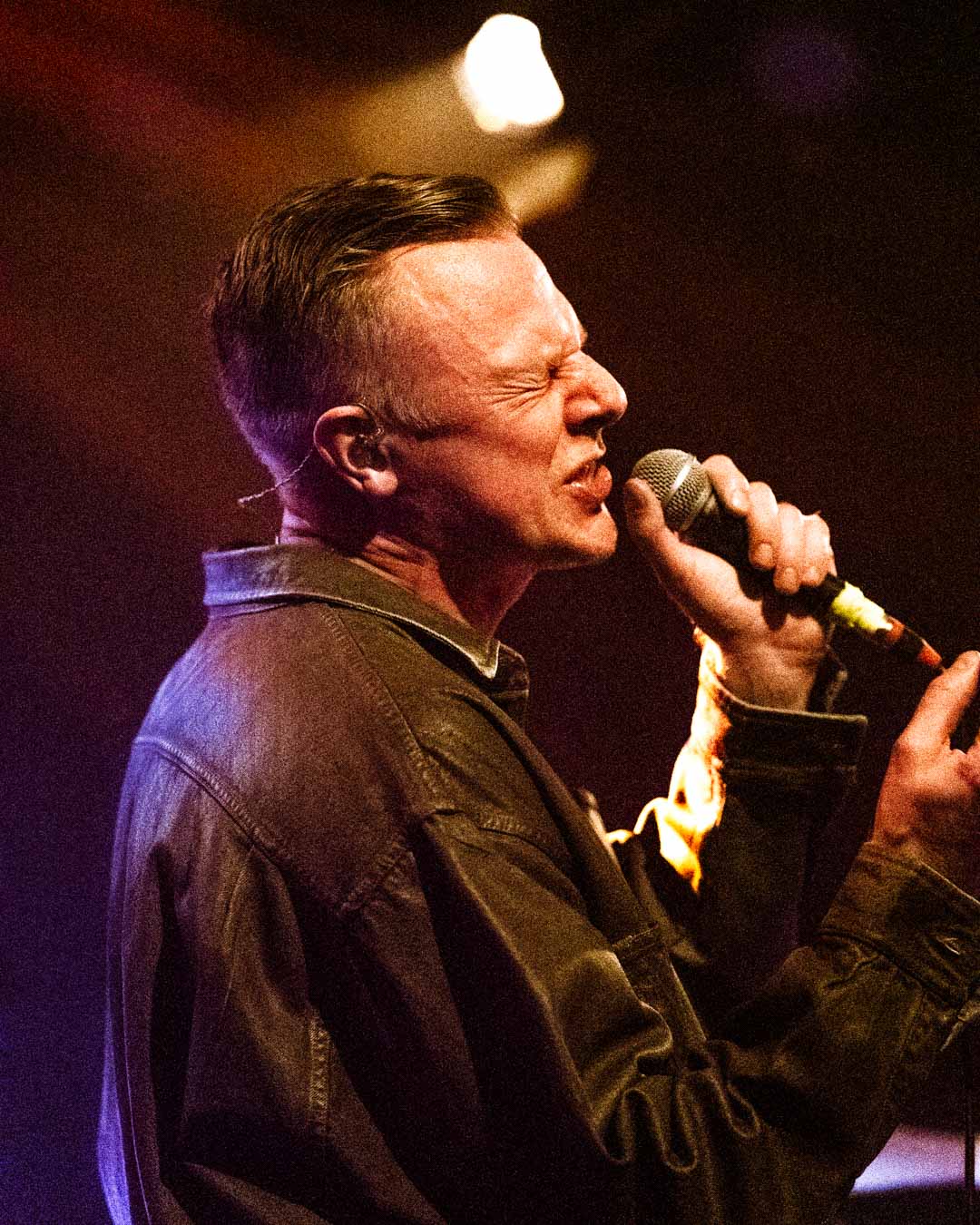
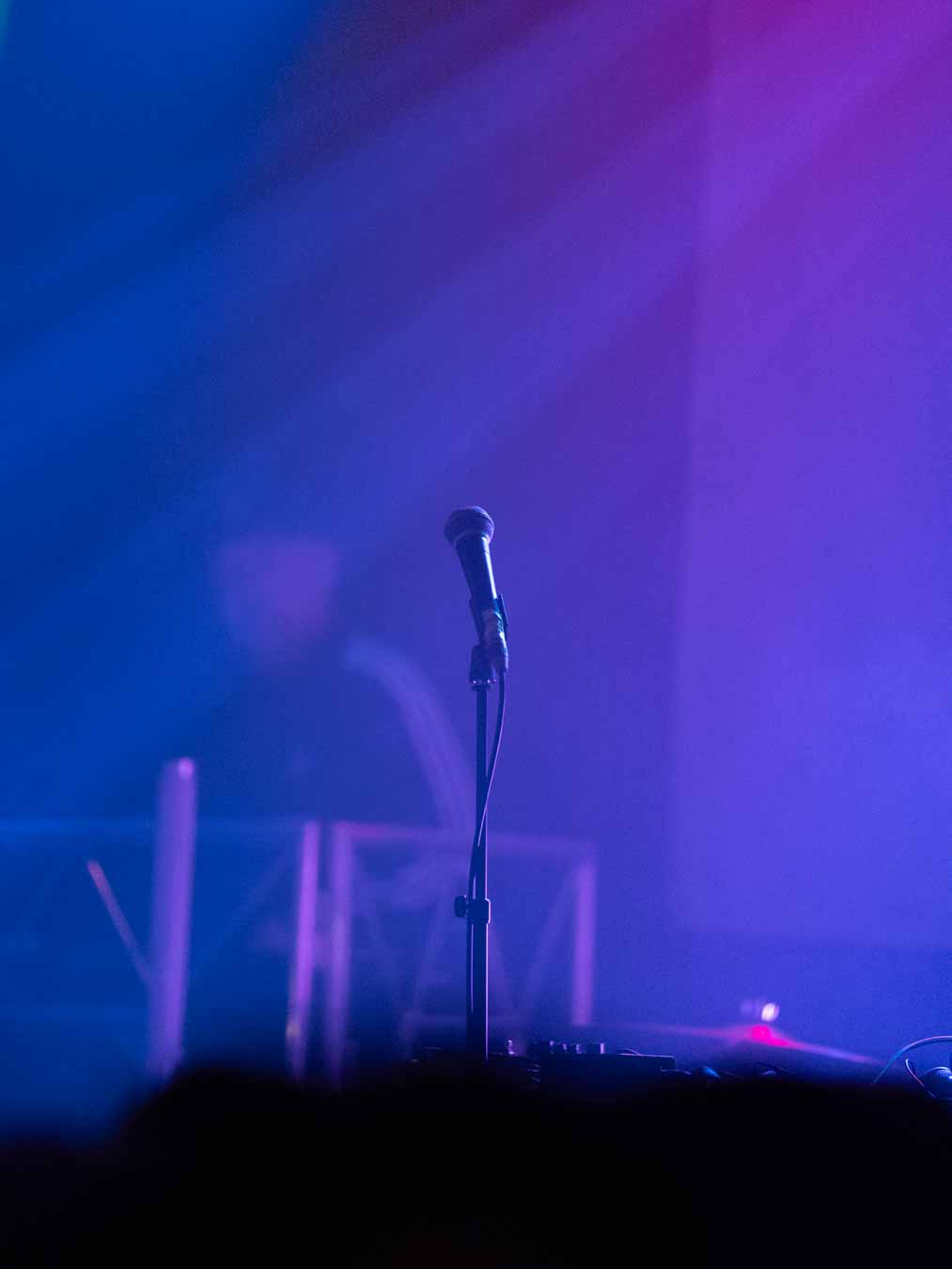
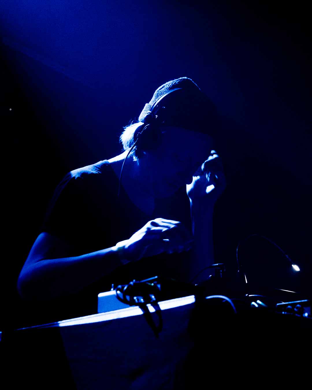
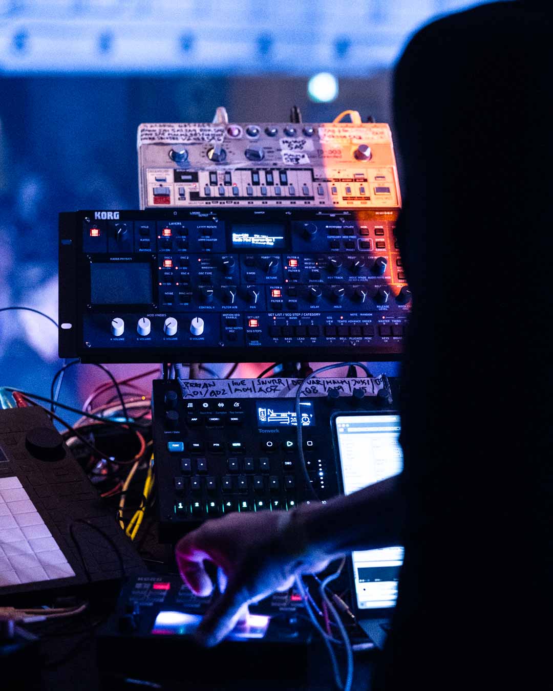
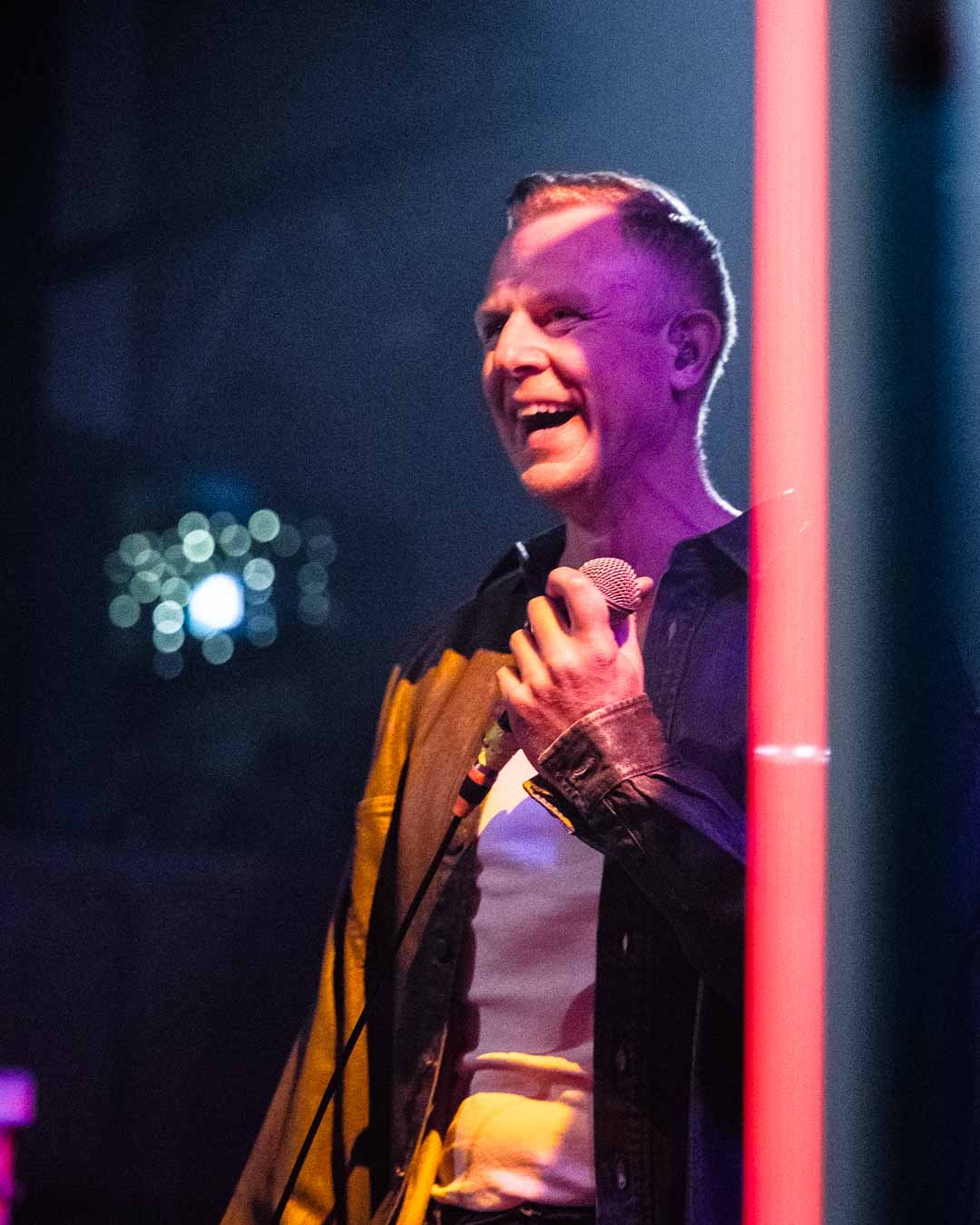
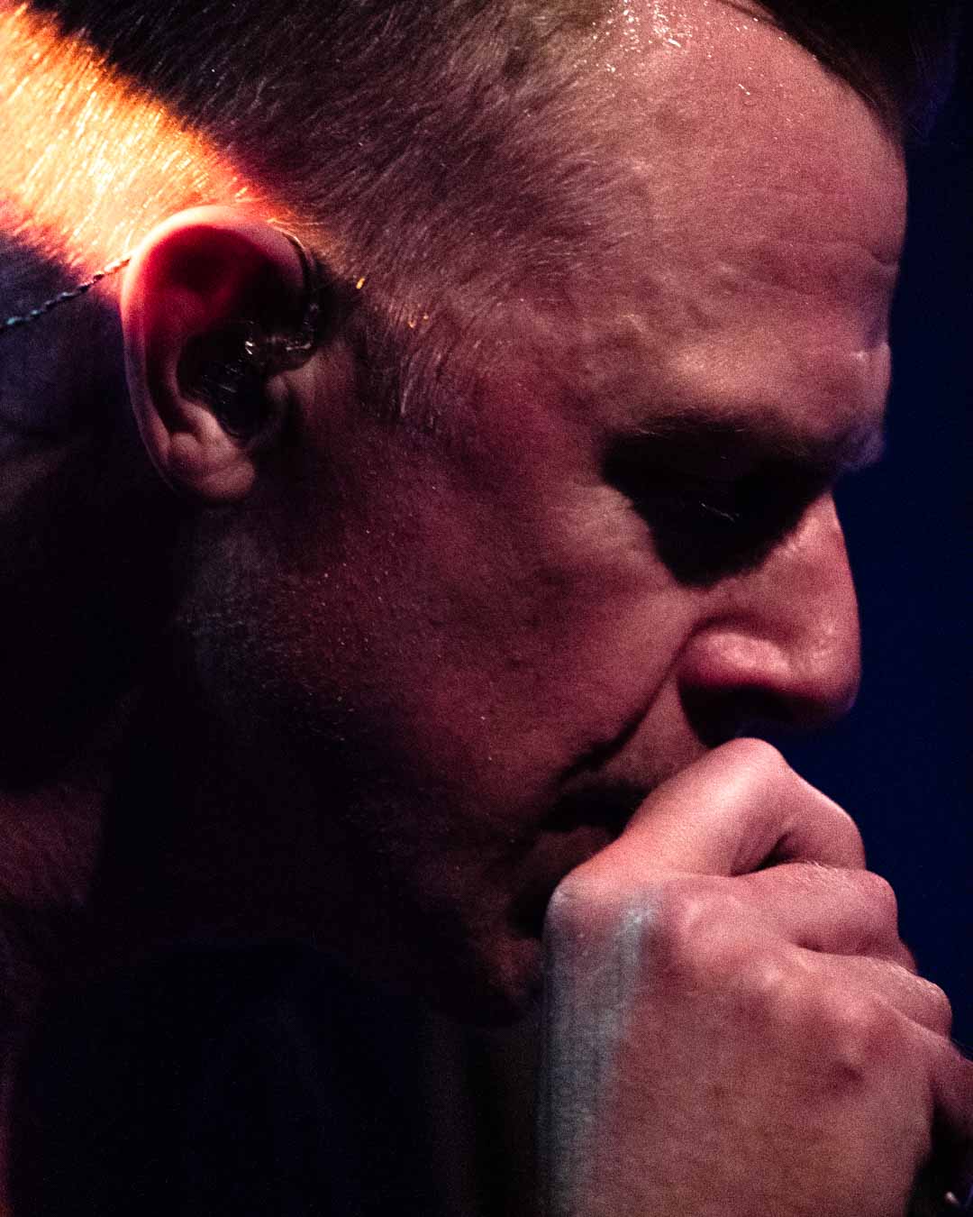
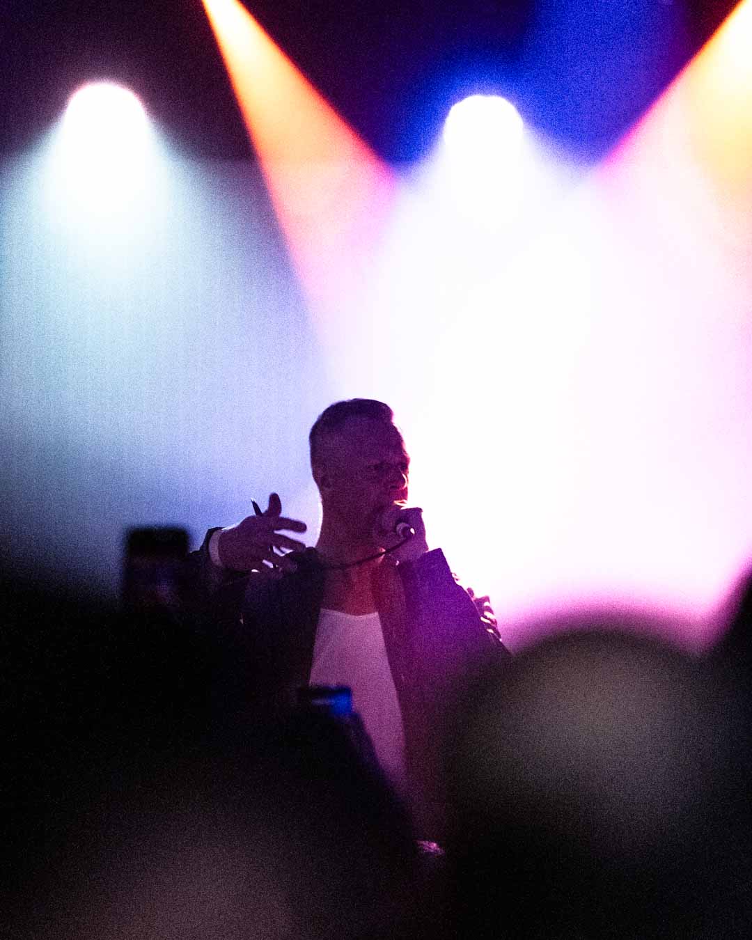
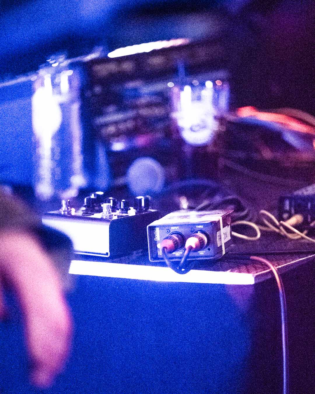
The event
The event was fricking awesome. We did sound check at
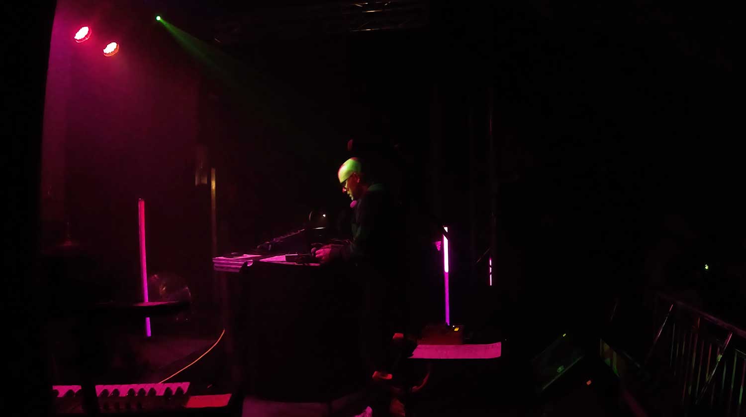
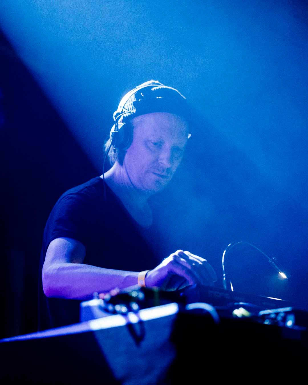
Plus I had the pleasure of shooting Familjen and Andreas Tilliander.