Nansen
- Design
- Web
- Roles and deliverables
- Brand identity, Merchandise, Signage, Mascot illustration, Website templates

I was asked by Chicago based agency Nansen to take an old brand and bring it back to life. I took inspiration from their office and the old brand and created something forward-looking.
Background
Nansen v1 existed 2010–2014, then it got acquired and became Making Waves. After a few years the staff at the Chicago office decided to buy out their part and relaunch it as Nansen. They wanted the new brand to pay homage to the old.
Concept
Most of the people working at the new Nansen worked at the old one as well. Many of them remembers the culture, atmosphere and all the good and bad things from back then.
What once was ↔ now
Means moving backwards, looking back, standing still, reverse.
So bringing the old brand back to life could not be about nostalgia, it could not be about trying to bring back what once was.
It had to be about starting from today and focusing on the future, what can be built from here forward.
Now ↔ what will be
Means respect, reminisce, building for the future, forward.
That became the beacon for the concept. Don't try to bring the old back to life, build something new upon the old.
The brand
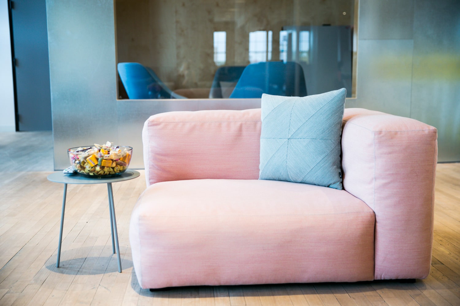
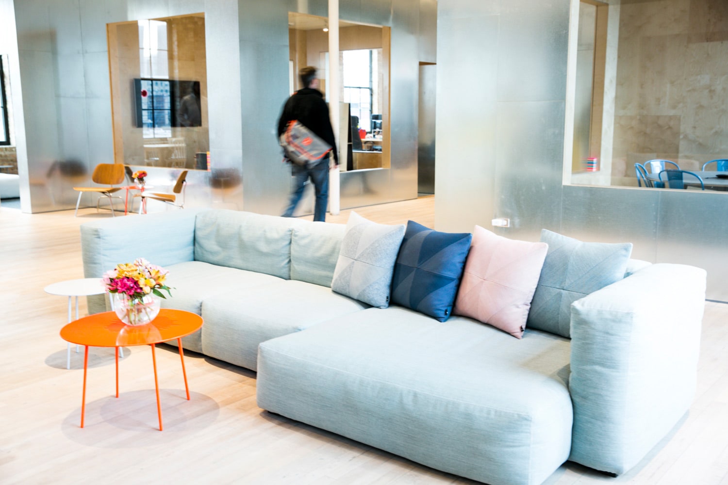
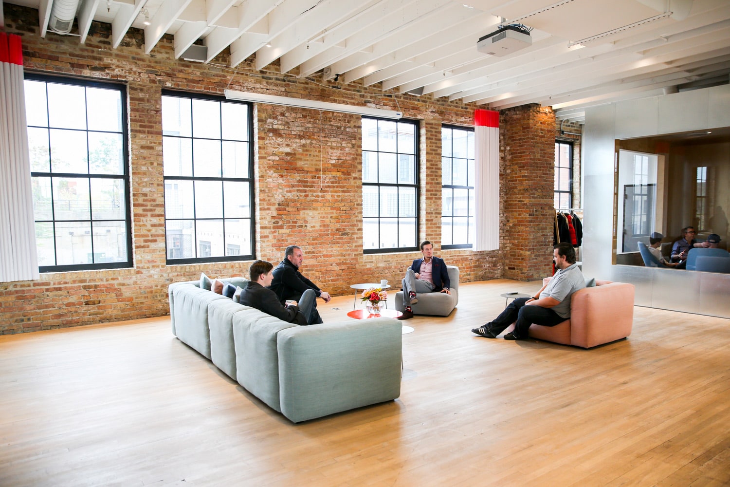
Since the concept was "Now and forward" I took a lot of inspiration from their current office, especially the lounge furniture at the front of the office. I just love the color of it.
A formal visual language
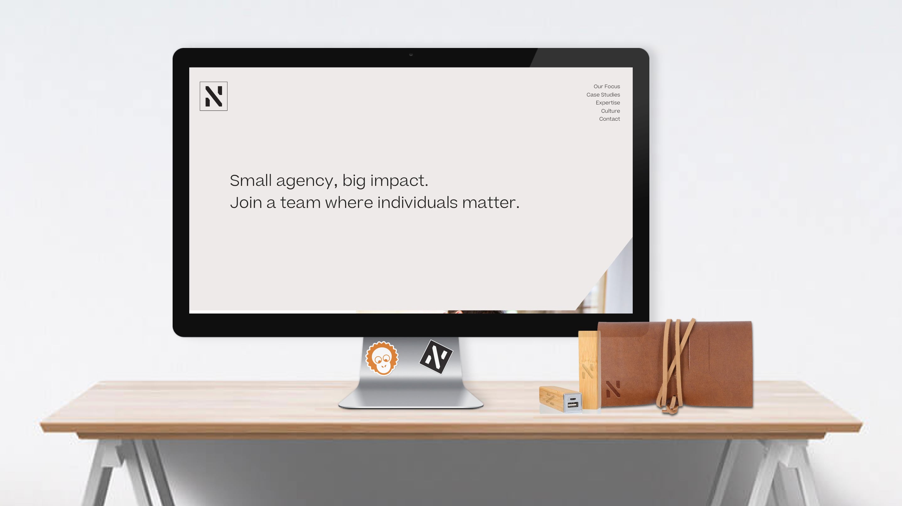
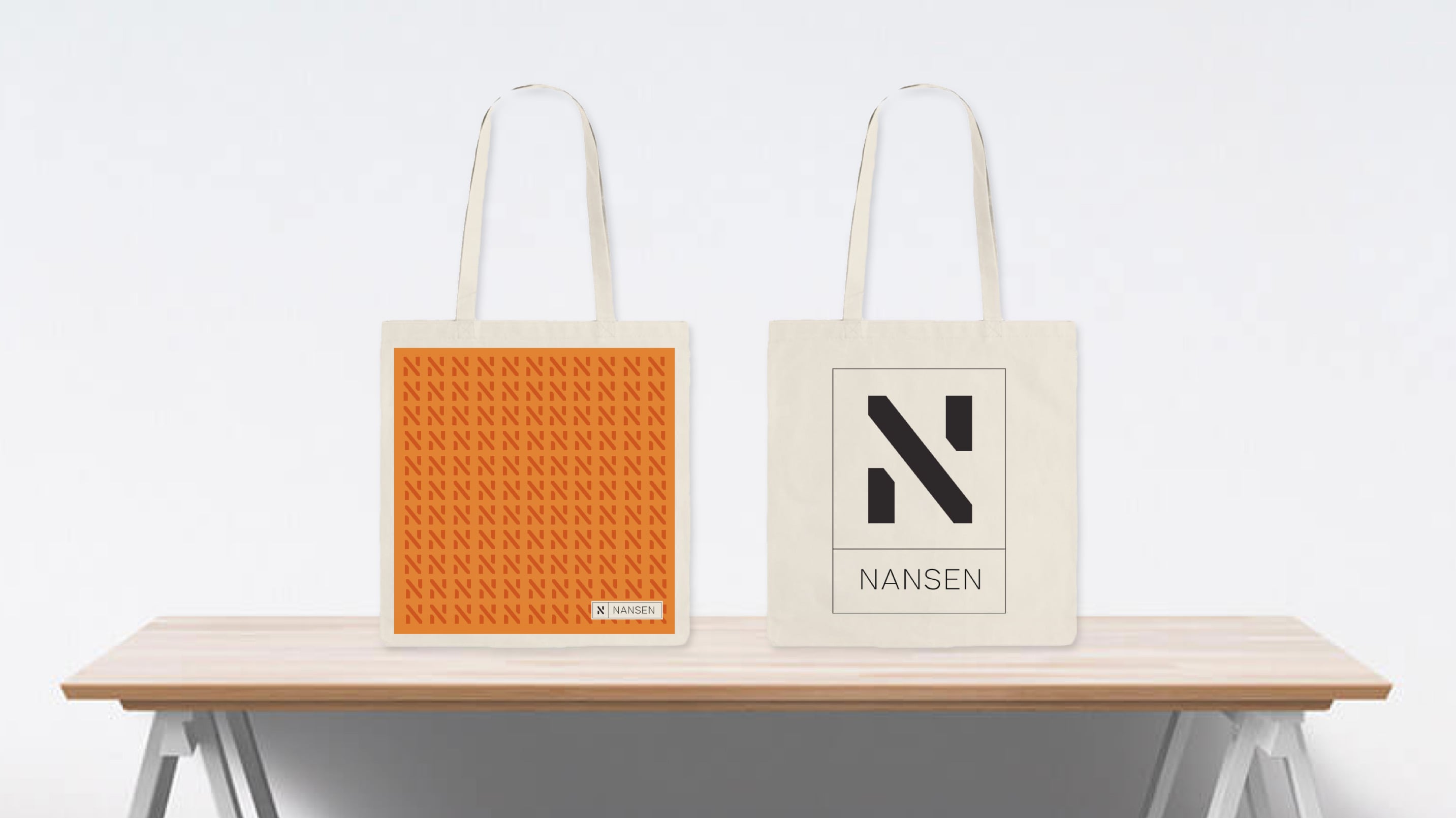
The new Nansen was about a new way of work so I tried to find a formal visual tone of voice that could be used in client meetings, presentations and all things you see below.
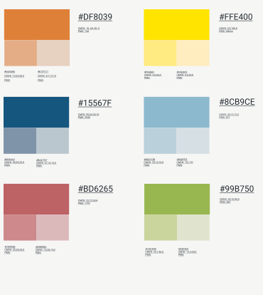
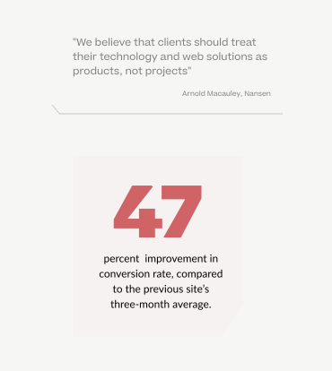
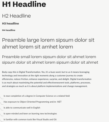
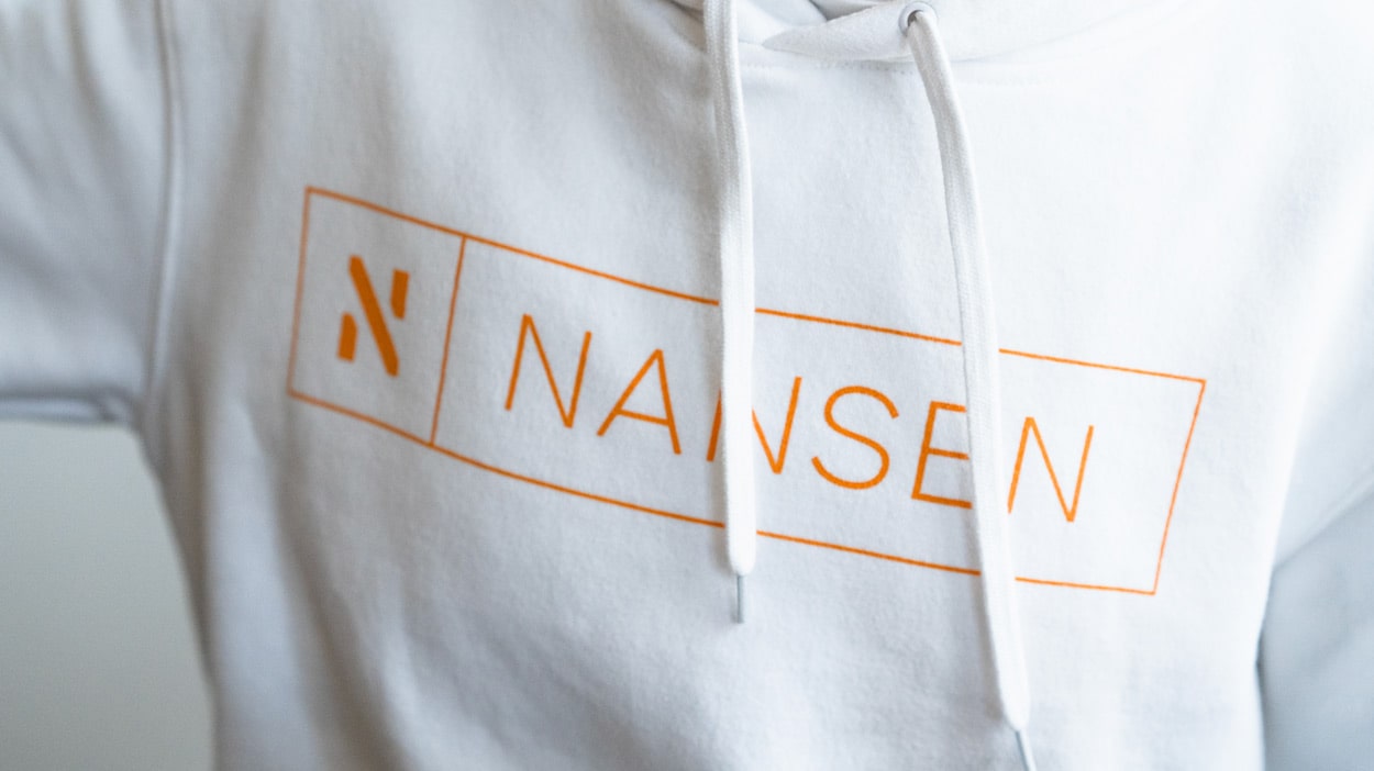
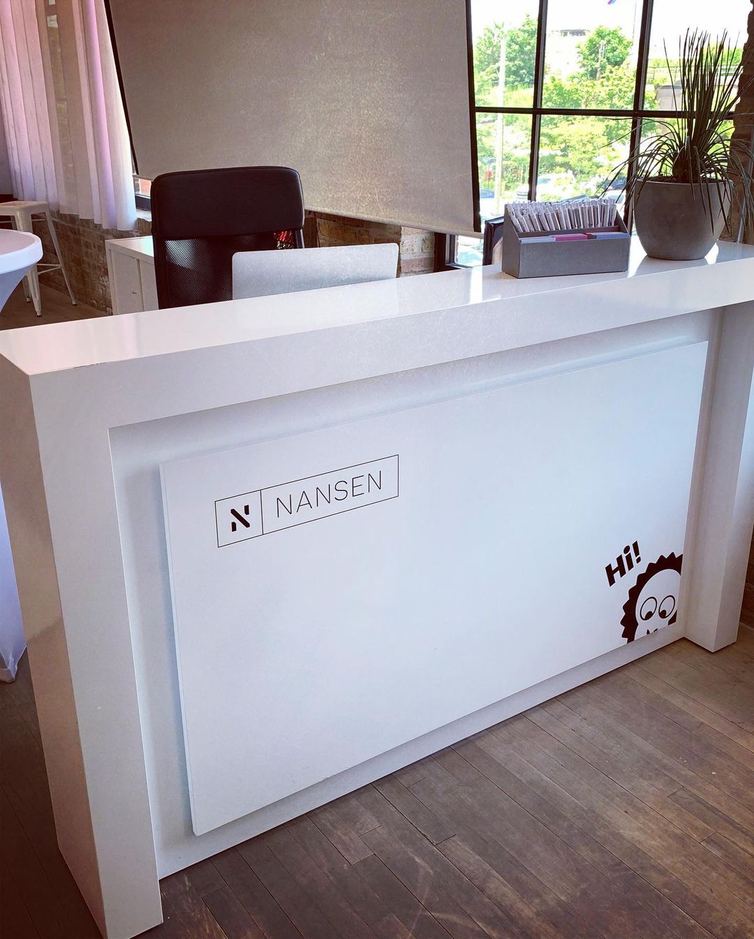
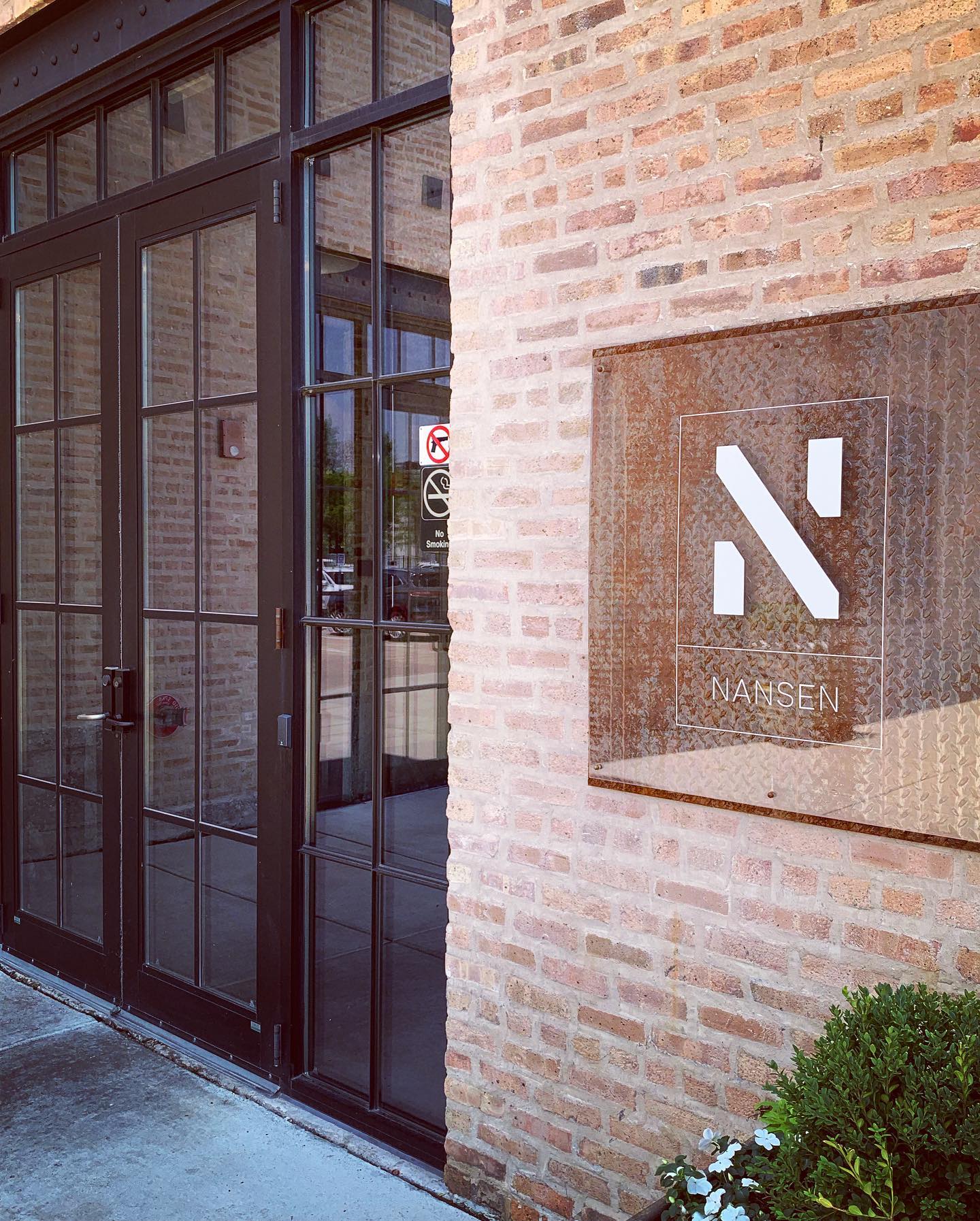
… and a casual visual language
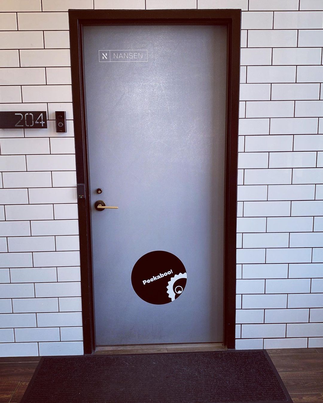
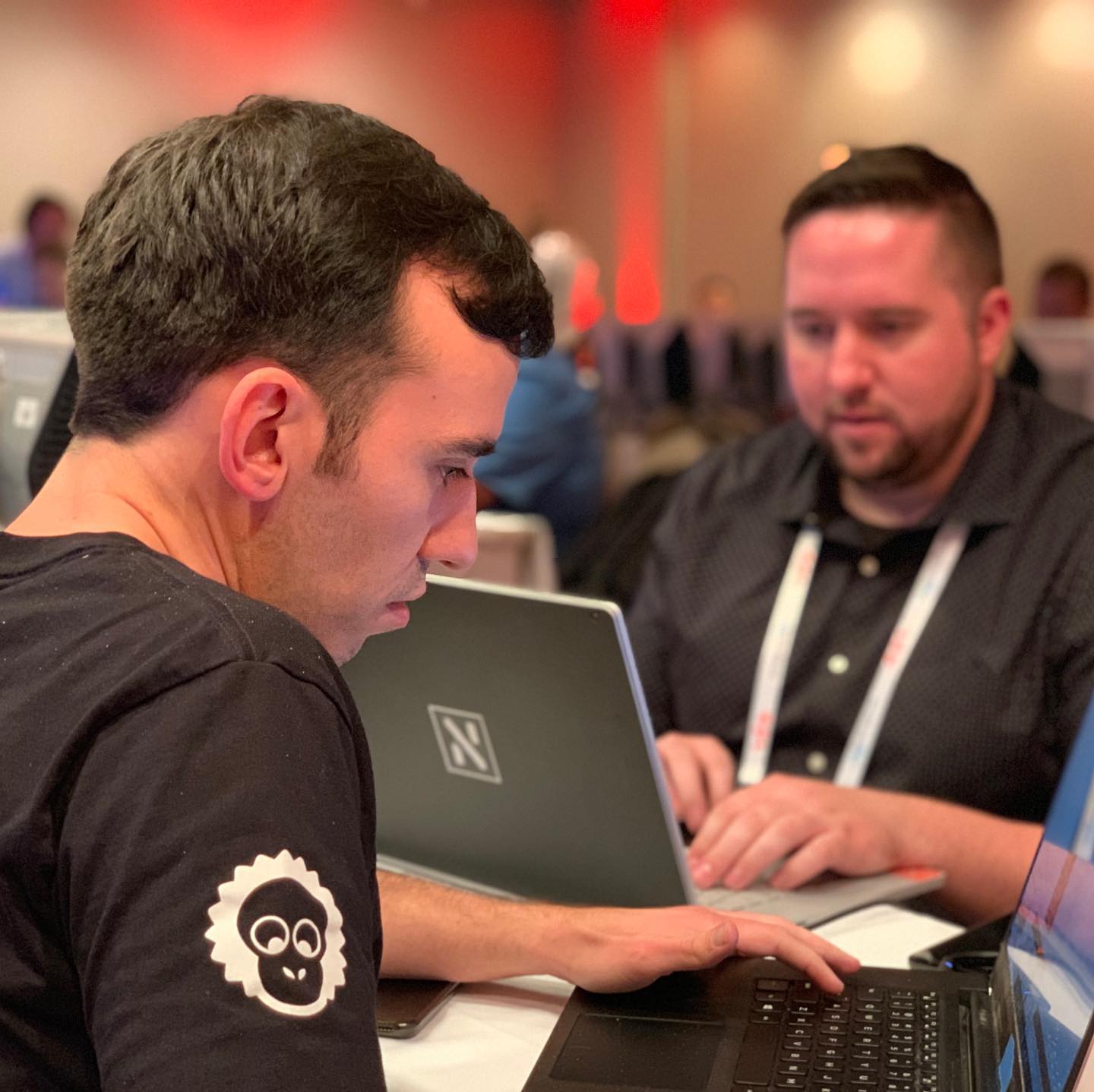
Since I’ve spent a lot of time at the Nansen office and know their personalities I know we needed an informal voice that could be used at meetups, after works and more casual situations. Enter the office mascot Richardo.
Richardo
Whenever you visit the Nansen office you will meet Richardo Fuentes Bergström. He is the cosiest, friendliest and most loyal of all Nansen people.


Richardo has always been at Nansen, he is constantly working over time, being lazy and hungover.
Employees always turns to him and sets him up for pair-coding, butt-xeroxing, binge-drinking, busking or child care. Everyone loves Richardo.
So I drew a Richardo character that could be used as a visual ice-breaker on the site, at the office or events.


The site
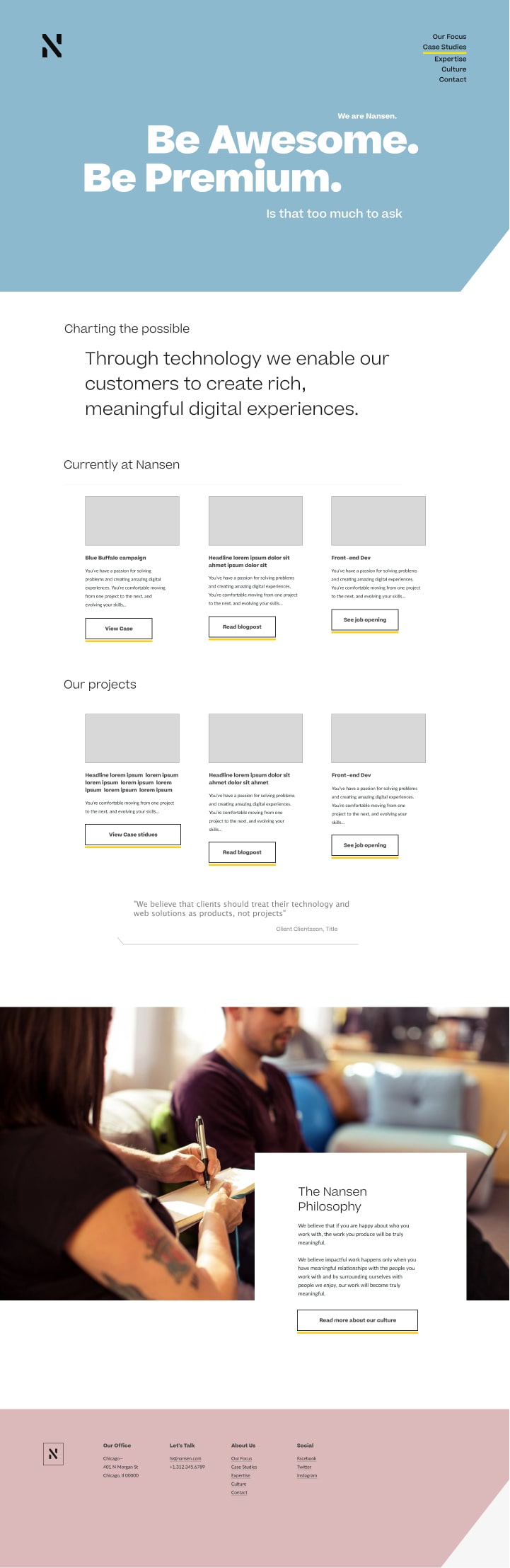
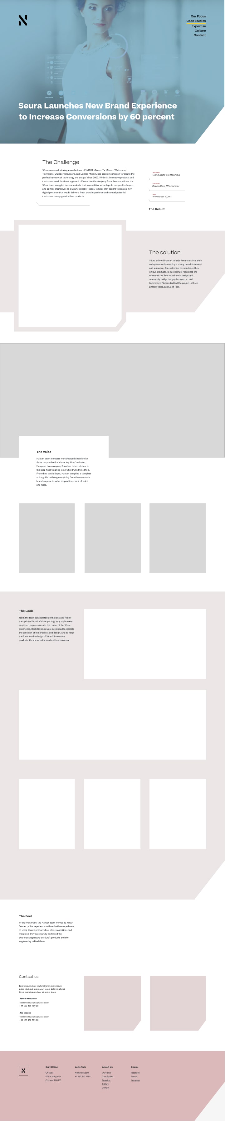
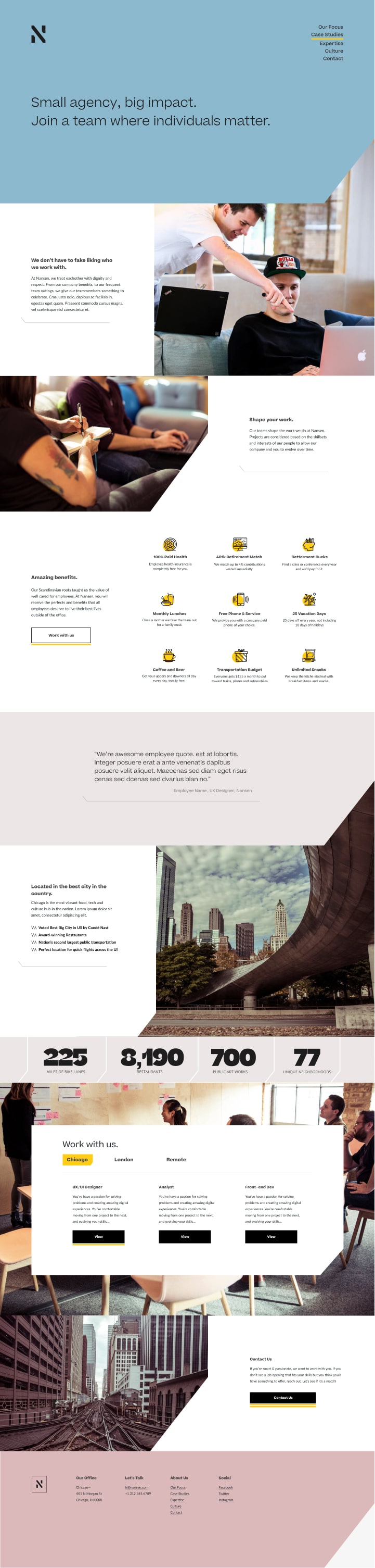
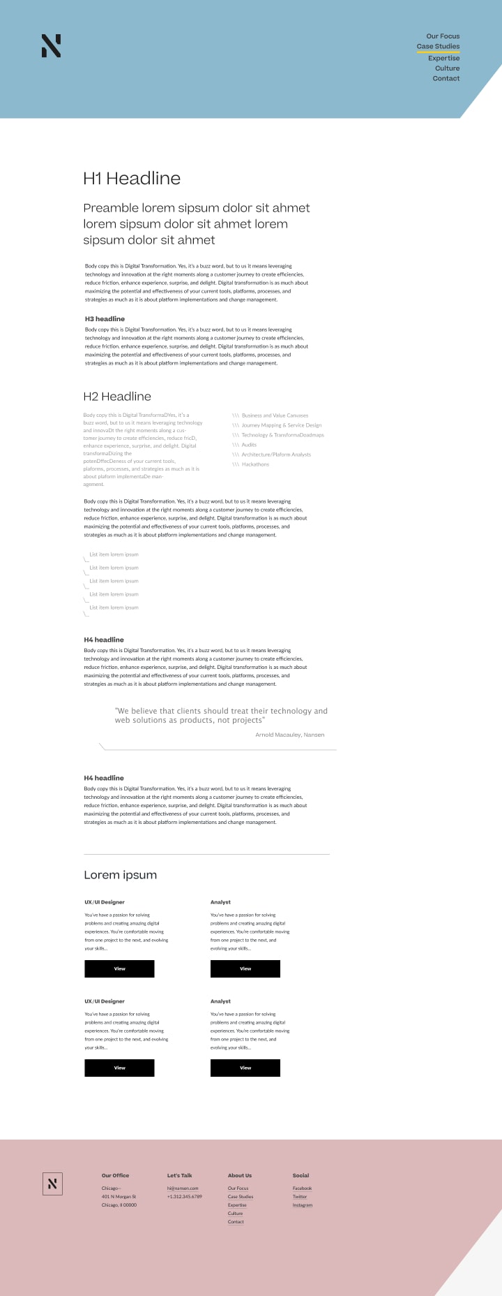
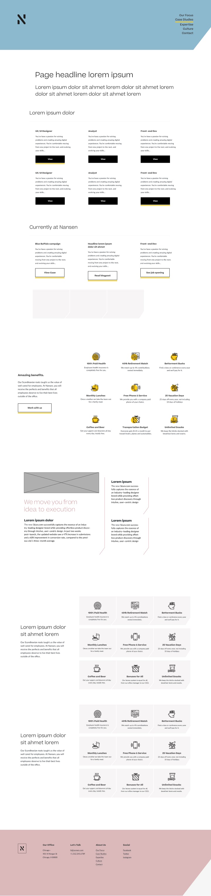
Instead of designing the full site I provided a set of template drafts. That way they could work internally on the full site.